
Is a Descriptive Logo Better for Business?
Let’s play a game. Imagine you’re walking down the highstreet and you see a sign outside a shop, the sign has a logo of a dog with a tennis ball on it. Without reading any more information, can you guess what kind of business it is?
A dog walker? Could be… Or a pet shop? Most likely.
Now picture that same sign, this time with a logo of a tree. Could it be a garden centre? Maybe a yoga studio? Could it even be a sustainable fashion brand? Or how about a landscaper? Or maybe it’s a greengrocers?!
Which one was easier to guess? Exactly.
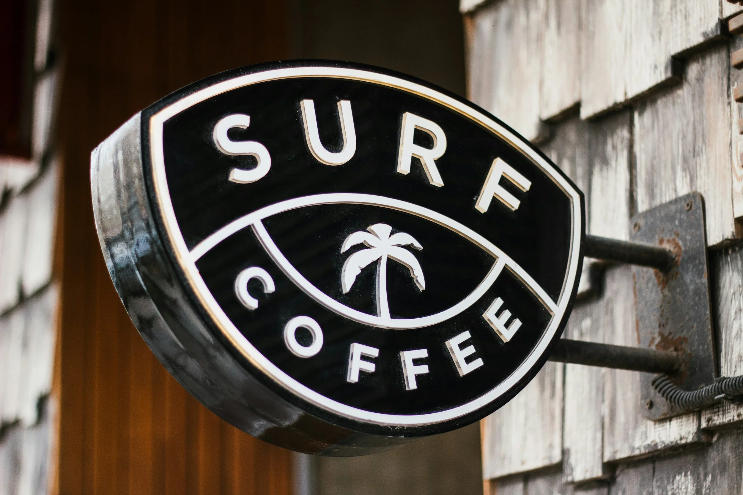
Logos often include textual and/or visual design elements that are descriptive of the type of product/service marketed by that business. For example, coffee shop logos frequently include a cup or a coffee bean to show a visual description of what the business offers.
However, it’s hard to know outside of anecdotal evidence whether using obvious visual descriptors like this actually make an impact on the effectiveness of your branding.
So, the question is: should your logo literally say what you do? Or is great branding more about the overarching vibe the design gives off?
According to a University of Westminster study called Let the Logo Do the Talking, the answer is... it depends. But the research found that logos that are at least somewhat descriptive tend to increase brand equity, especially for newer businesses.
So, let’s dig in.
A great logo isn’t about telling your life story
When you DIY your branding, there’s often a temptation to make your logo do the most.
You want it to show you’re creative. You’re fun. You’re an expert. You want the font to say “approachable but professional” and the icon to include your love of tarot, travel and turmeric lattes.
You scour the graphics section of Canva to find visual assets to say all of the above, squeezing assets down to teeny tiny sizes in order to cram it all in.
But here’s the truth: when your logo is doing too much, it ends up saying… nothing.
According to the study linked above, logos that clearly and simply suggest what a company does (think a burger for a burger joint) tend to make businesses feel more authentic and trustworthy in the eyes of their customers. Overcomplicating your designs may actually be making your customers trust you less!
That doesn’t mean you need to be boring, though. It means clarity is a good thing, especially when people are encountering your brand for the first time.
Don’t be afraid to own the obvious in your logo
Descriptiveness doesn’t have to mean cliché. You don’t need a paintbrush to show you're a designer, or a megaphone to scream "marketer!" But you also don’t need a logo that’s an abstract maze of metaphors that only makes sense after reading your brand story.
This is your permission slip to drop the pretence be a little more… literal. A little more obvious. A little more clear.
Because guess what? Obvious isn’t a bad word. Even if it’s something that received regular sneers from designers.
Obvious can mean accessible. Familiar. Instantly understandable.
When someone sees your logo and immediately gets the vibe, the tone, and the general gist of what you’re all about, that’s powerful. And it’s backed by research.
Is ‘obvious’ the right strategy for every brand?
Because nothing in life is ever as simple as a clear yes or no answer, descriptiveness isn’t a one-size-fits-all solution.
For some brands - especially those working in sensitive spaces like mental health, social change, or taboo topics - too much literalism can feel reductive, even clumsy. Plus, if you’re working in an industry with not-so-happy associations (funeral directors, divorce lawyers, brain surgeons etc etc) you seriously don’t want to be slapping your customers round the face with negative imagery. That is NOT a way to get people to buy!
In cases like these, subtlety and nuance can be more powerful than a straight-up visual metaphor.
And if you’re aiming for a premium or luxury feel? Research shows that more abstract logos often come out on top. They suggest sophistication, exclusivity, and aspirational energy. More “this is a lifestyle” than “this is exactly what we sell.”
In the end, it all comes back to strategy: your logo shouldn’t just say what you do. It should speak to how you want people to feel.
TL;DR? Keep it clear, keep it bold, keep it you
So, if your logo is beautiful but baffling, or if it only makes sense after a 12-slide story post, it might be time to rethink. Ask yourself:
Does it visually nod to what I offer or how I show up?
Is it simple enough to work in a tiny circle or big on a billboard?
Does it feel like me?
Your logo doesn’t need to explain everything. That’s what your website, your content, and your client experience are for. But it should welcome people in and point them in the right direction.
Need a second opinion on your brand visuals?
If your DIY brand has gone a bit rogue, or you’re ready to upgrade to something more confident, cohesive and compelling, let’s chat.
I specialise in wrangling wild brand ideas into bold, personality-packed visuals that actually work.
Want in? Check out my services or get in touch and let’s get your logo (and brand) doing the talking.