What happens when your business grows up but your brand and website don't get the memo? You end up with a brand that undersells you to the very clients you want to win. That's exactly where Aggie Meroni, founder of Meta and Google ads agency White Bee Digital, found herself when she approached me about working together.
Meet the Messy Frankenwebsite
Aggie's WordPress site had been edited, tweaked and bolted onto in bits and pieces over seven years. Her name for it? The Frankenwebsite. And honestly, she wasn't wrong. It was messy, disjointed and the branding changed depending on which page you landed on.
Meanwhile, White Bee had grown loads over it’s years in business. What started as Aggie flying solo was now a proper agency with a full team behind it. But the website was still telling the one-woman-band story, and bigger clients were picking up on it. They simply couldn't see the level of support White Bee was capable of offering, so they weren't trusting her with it.
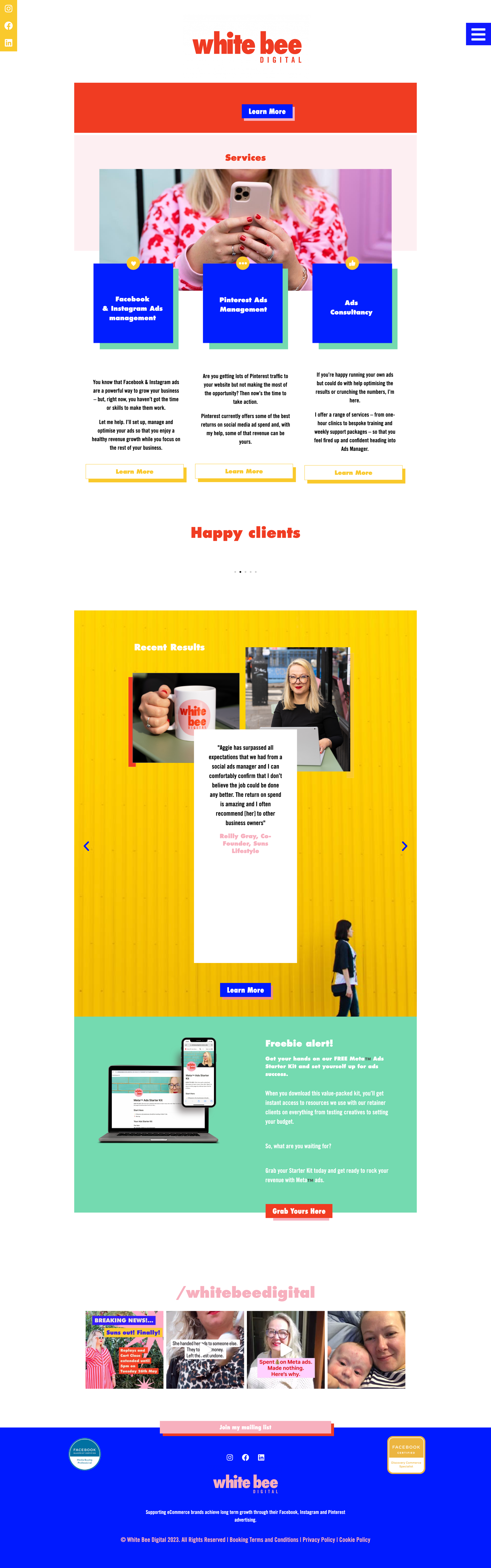
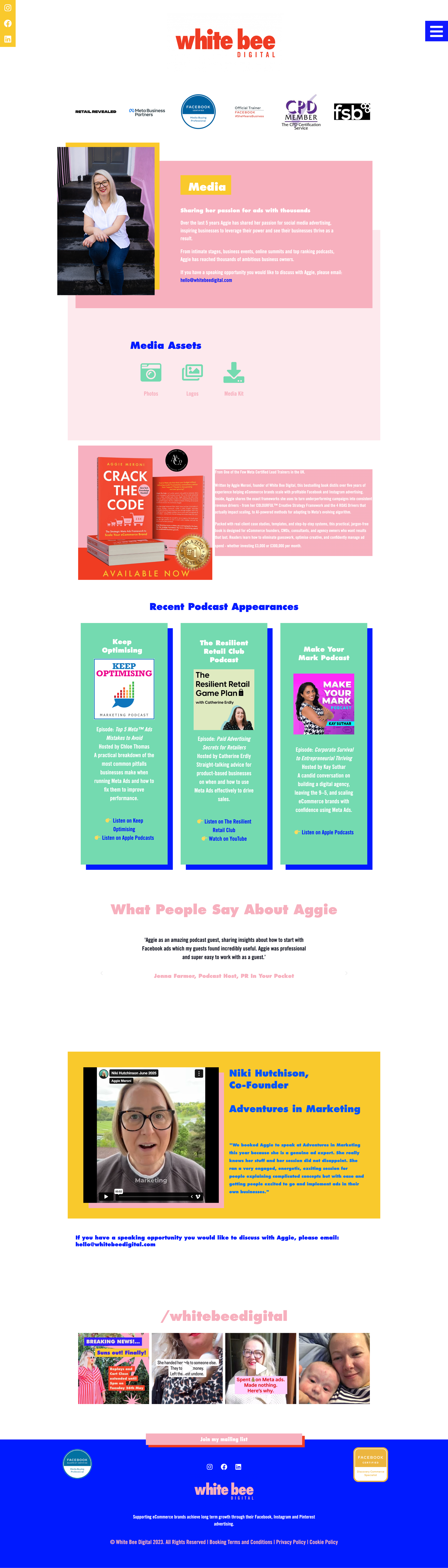
The old website worked, but it wasn’t inspiring clients to spend big money with her. The business had grown so much, but the website had just been chopped and changed until it felt messy and incohesive.
Keeping what works, levelling up the rest of the brand
Not every rebrand needs a bulldozer. Aggie was well known for her current logo and colour palette, and had just published her first book using both, so we kept them firmly in place. Throwing away recognition you've spent years building would be daft.
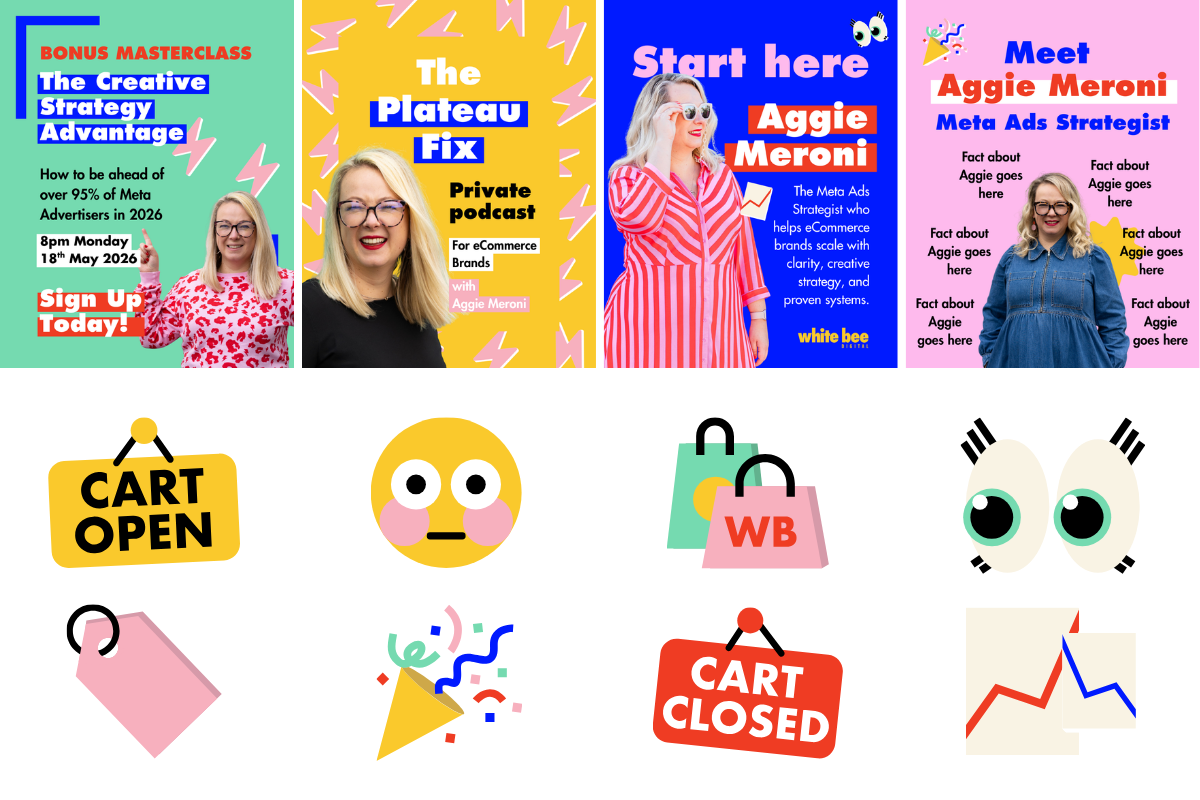
Instead, I gave the brand more room to play. I designed a set of custom emoji-style graphics to sit alongside the logo, giving the team a flexible toolkit they could use across socials, pitches and everything in between. We also created new and improved brand styles for their PowerPoint decks, so every presentation looks like it came from the same confident agency.
A Brand & website that finally matches the agency vibe
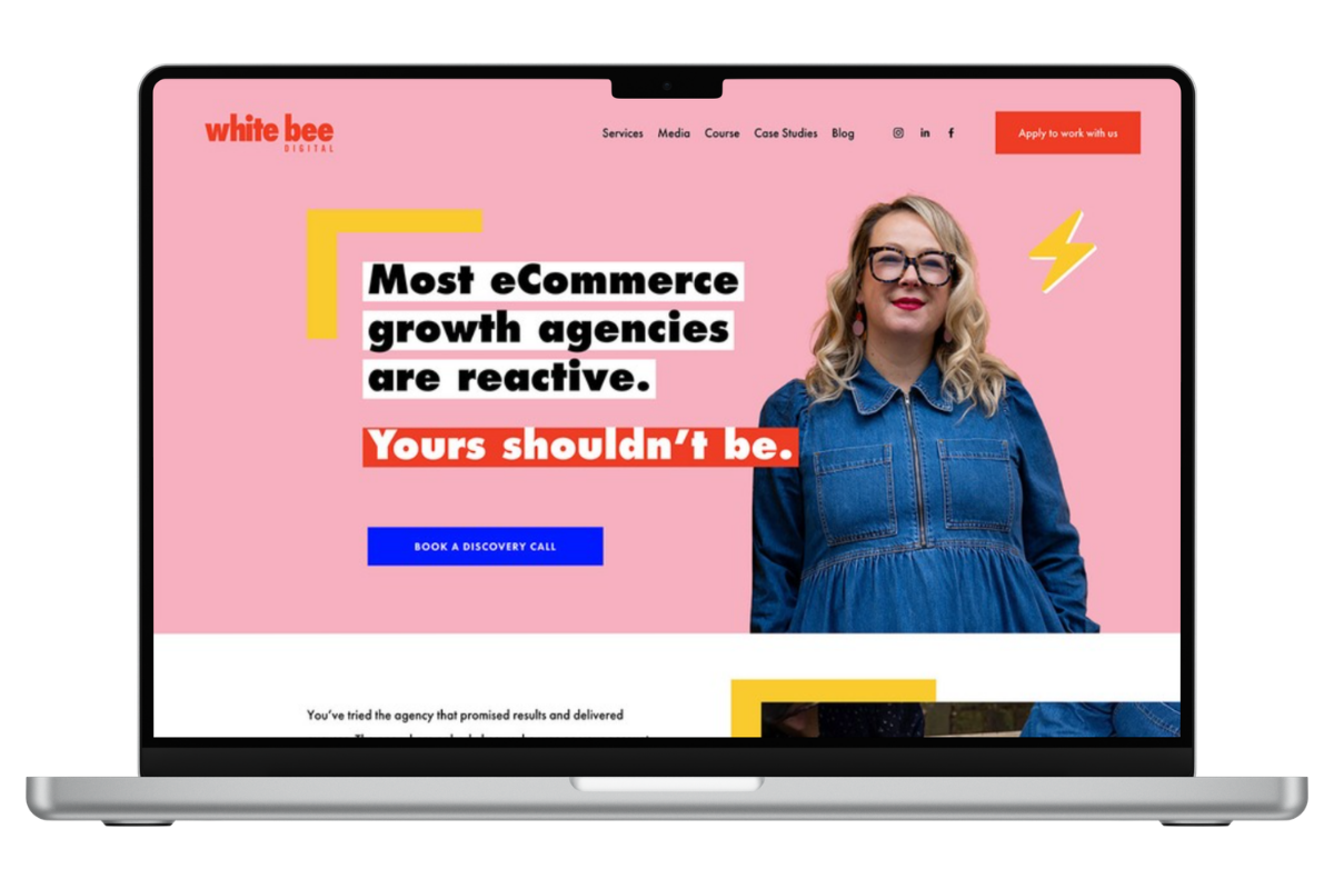
With the brand sorted, it was time to put the Frankenwebsite to rest. I rebuilt White Bee's site on Squarespace, bringing in the refreshed brand styles from top to bottom.
The big focus was clarity. I condensed pages that had multiplied over the years, created a more user-friendly flow between each area of the site, and clearly laid out White Bee's services and levels of support. No more guessing what the agency could do or how much help you'd get. It's all right there.
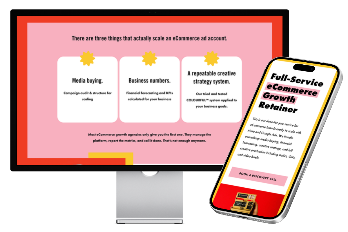
The result: A brand & website that screams big agency energy (finally)
White Bee Digital now has a brand and website that look the part of the large, capable agency it's become, rather than a homegrown team of one.
Aggie and the team can confidently pitch for bigger projects, knowing their online presence backs them up. And because they have clarity around every single brand asset, they're creating branded materials in a fraction of the time. Less faffing, more winning.
If your business has outgrown its brand and you're ready for it to catch up, let's make it happen.
You bring the ambition, and I'll bring the bold colours and the big plan. Book a chat with me and let's turn your Frankenwebsite into something you're proud to send people to.